Given that 52% of users point to aesthetics as the reason they don’t come back to an app, enhancing UI design is very important. However, designers should also remember that successful design goes beyond appeal. It must also tap into psychological principles to truly connect with users. This ensures the app is not just attractive but also user-friendly and intuitive.
In this article, we’ll outline some of the laws of UX design that can help your design efforts. Continue reading to start learning.
What Are UX Laws?
UX laws are based on psychology and studies of human behavior. Designers can use them to improve user interface design by making digital products that are intuitive and enjoyable. For example, the Law of Proximity influences how users scan and understand elements on a screen. Following these laws makes products easier to use. This reduces user effort and increases satisfaction. It also encourages users to keep coming back to the product.
Key UX Laws and Their Psychological Underpinnings
1. Law of Proximity and Law of Common Region

The Law of Proximity states that “Objects that are near, or proximate to each other, tend to be grouped together.” Similarly, the Law of Common Region says that “Elements tend to be perceived into groups if they are sharing an area with a clearly defined boundary.”
What we take from both these laws is that if you have elements that have a common purpose, or are on the same level of hierarchy, their similarity can be expressed by putting them close together (Law of Proximity) and by dedicating a space for them (Law of Common Region).
For example, take Kanban board designs where you’ve created a card that can be archived or deleted. By grouping the Archive and Delete options together under one menu, you highlight their shared administrative and destructive nature. This approach enhances the interface’s intuitiveness and its ease of use over time.

Credit: monday.com
Though this solution may seem simple, knowing the Laws behind it helps you explain your decision-making process more easily to your team.
2. Miller’s Law and the Goal-Gradient Effect

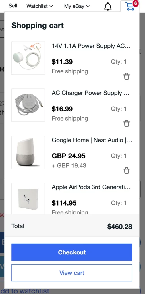
If you’ve ever purchased anything from an online Marketplace, you may find these laws familiar. Miller’s Law states that “The average person can only keep 7 (plus or minus 2) items in their working memory.”
The Goal-Gradient Effect, in turn, states that “The tendency to approach a goal increases with proximity to the goal”.
With this in mind, we can say that the more items a user puts into their cart in the Marketplace, the less likely they will remember every item, but their likelihood of completing the purchase increases.

Credit: ebay.com
To improve the chances of the buyer to complete their purchase, you simply have to offer users a quick way to view their cart, addressing Miller’s Law by reducing memory load, and by creating a simple path from the cart to checkout, leveraging the Goal-Gradient effect to encourage purchase completion.
3. Peak-End Rule

The Peak-End Rule states that “People judge an experience largely based on how they felt at its peak and at its end, rather than the total sum or average of every moment of the experience.”
This rule applies to any multi-step interaction, where each step builds upon the last.
For example, your experience reading this article. You’re likely to remember and judge it by the rule you find most interesting and the last one we share.
Going back to UX design, it is usually a good idea to emphasize the most valuable or helpful points within the flow, as well as at the end. Imagine searching for a rental on a property listing website. The key moment is when you find the perfect house. So, the webpage for that house should look great and clearly provide all the important details, making this high point as engaging and informative as possible.

Credit: airbnb.com, Yamsafer
After booking the house, the website could show a friendly “Thank You” screen, celebrating your successful booking.
Keep in mind that it is not only the good things your product can be remembered by. If there is anything that can irritate the user at these peak and end points, they are very likely to remember them. So, it’s important to smooth out any issues as effectively as you can.
4. Aesthetic-Usability Effect

One other UX law that is impactful is the Aesthetic-Usability Effect. If you ever wondered why everyone likes good UI, part of this is due to this rule.
It states that “Users often perceive aesthetically pleasing design as design that’s more usable.”
Upon seeing an interface, we instantly judge it based on its appearance. If the design doesn’t appeal to us, we’re more inclined to notice and criticize other flaws, such as unclear wording, navigation difficulties, delays, and glitches.
A visually appealing UI can sometimes compensate for these issues. It creates a positive impression that overlooks minor flaws during the user experience.
However, a word of caution: the Aesthetic-Usability Effect isn’t a fix for poor interface design and shouldn’t be over-relied on. At ORIL, we prioritize refining the logic and user experience before focusing on UI design. Only after these foundations are solid do we enhance the interface with styles and effects. This ensures the best of both functionality and aesthetics.
Over To You
Hopefully, this article was insightful and interesting. After learning how psychology and patterns can shape the UX, you can now create better designs and be able to explain your design solutions. If you are interested in learning more about the Laws of UX, visit lawsofux.com to find a full list of the laws.


