There is no denying – a prototype is an invaluable component of custom software development. But sometimes it happens that important things take a back seat for no logical reason.
In many teams, a prototype is treated as something negligible. The ORIL team is here to right a wrong. We will show how your entire team can use prototypes to achieve a common goal – build a quality product users love.
What Is a Prototype?
The ‘prototype’ has plenty of implications. In general terms, it stands for a product created to bring an idea from a mental concept to the physical world. It’s a sort of a test-drive that lets you check whether your idea is technically feasible. A prototype allows you to feel how the desired features work and what value they bring to users. As the model of your future product gets a tangible form, you may see potentially unrefined things you will want to polish in the final product.
With a prototype, you can carry out a proof of concept to answer the following questions:
- Does the product work the way I want it to?
- Does it look good?
- What do I need to improve to make it better?
You can also conduct usability testing to improve it. Once the prototype has no logic gaps as well as looks and feels good, you can invest resources (work, time, and money) to get a final product. This time, you will know for sure that you have reached your goals.
Wait, But What Is a Prototype in Design?
ORIL suggests the following definitions of a prototype in design. Check out the table below.

No matter what definition you stick to. They both complement the main prototype principle – SHOW, DON’T TELL.
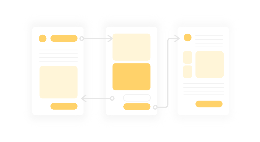
Prototypes are not static. The great thing about them is that you can interact with the interface. Yes, that’s a pretty amazing feature. Especially considering that this is a pack of images. You can log in to the system, navigate between the tabs, turn the tumbler on and off, and so on. And see immediate changes.

That’s the behavior emulation in action. The trick is that it is implemented in the same software used for creating the product design. Which saves your resources.
What Are Prototypes Used For?
Prototypes can fulfill various goals. Below, we will look at the core prototype purposes.
Presentation
Our clients are our everything – we strive to deliver the best communication across all project stages. With prototypes, we show that their ideas are doable in a pretty effective way. Instead of showcasing static screenshots of the product interface, we give a prototype – an animated product presentation.
We believe that there is more sense in prototypes than in raw images. With prototypes, clients get the nearly-the-same experience they would have with a final product. Further, the client can use the prototype to present the business idea to investors to prove it is worth financing.
So, at the stage of presentation, the prototype:
- Improves communication with a client
- Encourages the client to invest in product development
Testing
Let us put it straight right away. This is not the same as QA testing. Using a prototype, designers rather spot inconsistencies or gaps between the screens rather than warn about potential app issues.
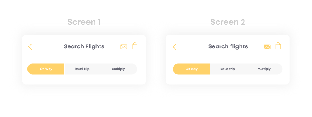
Still, this aspect of prototype use is essential. For example, look at the screenshots below. Have you also noticed that Screen 1 and Screen 2 have inconsistencies in the case? Right, these are the same elements, but the cases are different. Now, we can fix that and avoid this issue at the development stage.

Or you can benefit from the prototype in the following way. As you click between the tabs or follow the navigation menu, you may come to the conclusion that some interactions are not as logical as you wanted them to be. They may lack particular screens or, on the contrary, you may want to get rid of some to add more clarity.
So, when you have a prototype at hand, you can click through the screens and spot:
- Inconsistencies between similar design elements or blocks
- Gaps in navigation or interaction with product screens
Documentation
Using prototypes for documentation is so obvious, but many teams omit this. Though, in fact, prototypes are a true gem for designers.
Prototypes explain behavior much better than words do. Without them, we would have been committed to writing tons of documentation (which no one will ever read). In particular, when it comes to navigation between the screens.

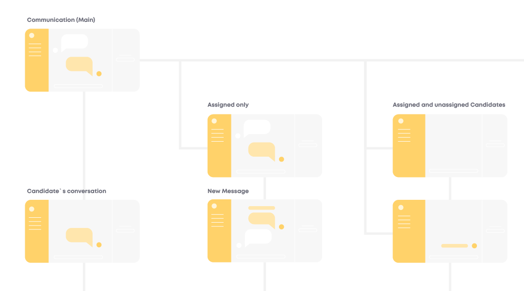
In fact, a prototype is a glue that holds designs together. When you create a prototype, you can group the screens together according to specific logic. Yes, you can achieve that with the screen layout, but prototyping is a more straightforward way of maintaining the screen hierarchy.
Also, a prototype simplifies communication with teammates. How can you better translate your train of thought rather than with a physical representation of a product concept?
Though, there is a misconception that prototypes are used exclusively in the design kitchen. Hah, if you stick to this approach, you are missing the point.
| A prototype is a design deliverable, just like any other designer’s contribution to the project. Thus, it should be used by the entire project team, not just designers. From the designers’ part, they should do their best to make prototypes as neat as possible. So that the team could extract value from it to the fullest. |
What can a team do with a prototype? Here are some hints:
- Request to create one
- Review it
- Request to make changes
- Rely upon it for future work
Animation in Prototyping
Here is a typical story. You need to showcase the transition from one state to another. Where the transition is animated and somewhat uncommon.
So, here is what you do without a prototype. You explain it in your own words, which gives room for misinterpretation by a client or teammate. And we all know how it all ends. Your point of view is different from what the client thinks (or you both assume so). So it takes time to come to the grounds. Sometimes to reveal that you were on the same page.
Or you go to a dedicated animation app. But this turns out to not be the best solution. You pay app fees and invest time in growing the skills to work with that app. All in all, this is not the fastest way of getting things done.
Prototypes are awesome because they allow adding basic animation to communicate the future product’s behavior to the team or client without the need to create complicated animations in external software. Money and time saved!
How to Make the Most of a Prototype
Are you excited about using a prototype? Then grab tips from our designers to be sure you fully leverage it.
1.Create it as soon as possible. – Start working on a prototype alongside wireframes. You will use it to test and present wireframes. Then, you will migrate the prototype to the UI.
2.Keep it up-to-date. – Get new change requests – update the prototype accordingly. How else would you keep it relevant? P.S. Add these changes to the design estimate.
3.Use it! – We mean it – take full advantage of it. If you are a designer, teach your team to use it and keep it easily accessible. If you are a PM/Dev/QA Engineer, use it to reference designs.
Also, here are a few considerations for you. Prototypes are not perfect. And they don’t have to be. Think of them as a tool to test-drive the future product and see what works and what doesn’t.
Do not try to make the prototype overly complicated by fitting every flow and sub-system into it. Create one prototype for every flow in the system.
If due to technical reasons (the lack of functionality in software you use for prototyping) you can’t implement a particular design element, warn the team or client about that.
The Bottom Line
A prototype offers a great way to keep an eye on whether the product functionality is doable and how it is going to be implemented in the long run. From the internal workflow’s side, prototyping improves communication and collaboration within the team. It all comes down to a single purpose – to bring the best out of your product potential.


